Section C (4) of the Performance Management syllabus deals with pricing decisions and this topic can be conveniently divided into two parts:
- Theoretical approaches involving some relatively simple mathematics and microeconomics. These methods require accurate economic information about how a product’s sales volume is affected by its selling price.
- Practical approaches which are likely to be more applicable to the many businesses that do not have the detailed economic information referred to above.
This article deals with the theoretical aspects of pricing and a second article deals with practical pricing.
Demand curves
Demand curves show the relationship between the price per unit of a product, P, and the quantity of units sold, Q. In your exam you will be dealing with demand curves which are simplified and which can be represented by straight rather than curved lines.
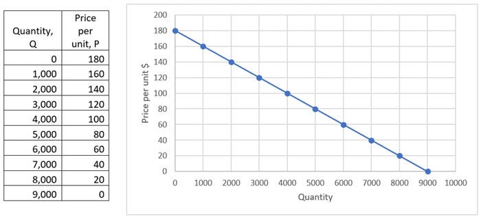
They are always drawn with Q on the horizontal axis and P on the vertical axis. For example, here is a table showing price and quantity and the corresponding demand curve:

The demand line slopes downwards showing that as the price decreases the quantity sold increases. You can see from both the table and the graph that for every $20 decrease in price, the quantity sold increases by 1,000 units
At a price of $180 all demand is extinguished and at a price of $0 a maximum of 9,000 units could be ‘sold’. You might be able to see that at a price of $180 revenue will be zero as no items are sold. At a price of $0 revenue will also be zero as no charge is made for the products.
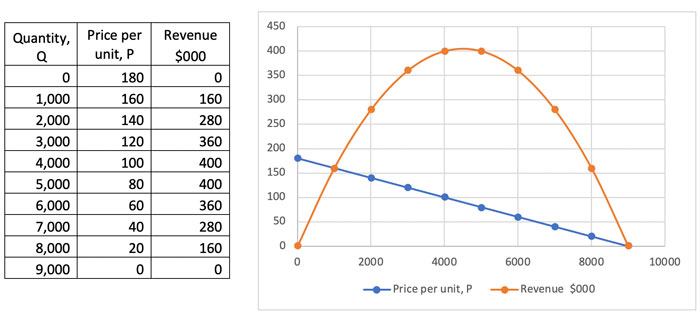
The revenue can also be plotted by calculating Price x Quantity at each level:

So, revenue rises then falls, hitting a maximum at between 4,000 and 5,000 units sold.
On the left-hand part of the revenue curve, as the selling prices fall from 160 to 140, to 120 etc and quantity sold rises from 1,000 to 2,000 to 3,000, revenue increases: the increases in quantity outweigh the decreases in price. In this area, demand is said to be elastic as a relatively small proportional decrease in price causes a relatively large proportional increase in volume and so revenue increases
On the right-hand part of the revenue curve, as the selling prices fall from 80 to 60, to 40 etc and quantity sold rises from 5,000 to 6,000 to 7,000, revenue decreases: the increases in quantity are outweighed the decreases in price being applied to all units. In this area, demand is said to be inelastic as a decrease in price causes a relatively small increase in volume and so revenue decreases.
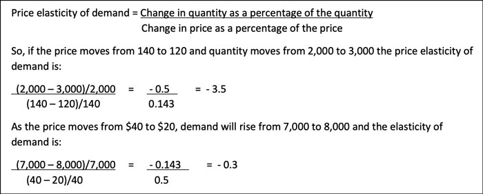
The definition of the price elasticity of demand is:

It is usual to omit the minus signs so the two elasticities are 3.5 and 0.3.
If the price elasticity of demand is greater than 1 then demand is elastic. This is so on the left-hand part of the revenue curve. If the price elasticity of demand is greater than one then a drop in price is more than compensated by the increase in volume and revenue increases.
If the price elasticity of demand is less than 1 then demand is inelastic. This is so on the right-hand part of the revenue curve. If the price elasticity of demand is less than one then a drop in price is not compensated by the increase in volume and revenue decreases.
If the elasticity of demand is exactly 1 then any change in price is precisely compensated for by an increase in volume and the revenue stays constant. This is what is happening at the small section at the very top the revenue curve. Where the line changes from increasing to decreasing.
Marginal revenue
Associated with the elasticity of demand is the concept of marginal revenue, which is the change in revenue when one extra unit is sold. If figures for one extra unit are unavailable the marginal revenue for (say) 10, 100 or 1,000 extra units can be used instead.
If you look again at the revenue curve, you can see that on its left side, revenue is increasing as more units are sold. The marginal revenues will be positive here. At the earlier, steep part of the curve, revenue is increasing quickly as each extra 1,000 units are sold: marginal revenue will be high. The steepness declines as you move along the curve until at the top the marginal revenue will be zero (no change in revenue) then the revenue line starts to fall meaning that for each 1,000 units revenue decreases and marginal revenue is negative.
High positive marginal revenue implies a high price elasticity of demand ( >1). A negative marginal revenue implies a low elasticity of demand ( <1).
The marginal revenues can be worked out from the table as follows:
|
Q |
P |
£000 |
£000 |
|---|---|---|---|
|
|
|
|
|
|
|
|
|
|
|
|
|
|
|
|
|
|
|
|
|
|
|
|
|
|
|
|
|
|
|
|
|
|
|
|
|
|
|
|
|
|
|
|
|
The marginal revenue is obtained by calculating the increase in revenue for each increment in volume. Thus at 4,000, the marginal revenue, MR = 400 – 360 = 40.
You will see that MR starts large and positive, decreases, then turns negative indicating that as more units are sold revenue actually decreases because the drop in price needed to sell more units outweighs the extra units sold.
Profit maximisation
To calculate profits, costs as well as revenues have to be taken into account. You will usually be dealing with a simple cost function:
Total costs = Fixed costs + (Variable cost per unit x Quantity sold)
Say that for this example, fixed costs are $50,000 and the variable cost per unit is $65, then
Costs = 50,000 + (65 x Quantity)
Costs can be added to the table as follows as can profit, being the difference between total revenue and total costs:
Q | P | $000 | $000 | $000 |
|
|---|---|---|---|---|---|
You can see that profit is maximised when the selling price is $120, generating sales of 3,000, revenue of $360,000 and costs of $245,000.
Using a table in this way and calculating the profit at each quantity sold is known at the Accountant’s approach. The Economist’s approach is different. Economists argue that as each extra unit is sold if the extra revenue generated (the marginal revenue, MR) exceeds the extra costs incurred (the marginal costs, MC), then it is worth making that item. However, if ever MC > MR it means that selling the extra unit will lose money as the additional costs are greater than the additional revenue.
So long as MR > MC, make and sell the unit; if MC < MR don’t make and sell that unit.
Profit is therefore maximised when:
MR = MC
The table below now also shows the marginal costs:
Q | P | $000 | $000 | $000 | ||
|---|---|---|---|---|---|---|
You can see that the marginal costs are constant at $65,000 per extra 1,000 units and this is simply the extra variable costs of $65 per unit.
Moving from 1,000 units to 2,000 units generates an extra $120,000 revenue for additional costs of $65,000. So, worthwhile.
Moving from 2,000 units to 3,000 units generates an extra $80,000 revenue for additional costs of $65,000. So, worthwhile.
Moving from 3,000 units to 4,000 units generates an extra $40,000 revenue for additional costs of $65,000. So, not worthwhile. Nor is it worthwhile increasing quantity any further.
When MR > MC, sell more. When MR < MC sell less. Profits are maximised when MC = MR.
Therefore, as before when we looked directly at profits, we have identified that sales of 3,000 units will be where profits are maximised and these sales will be generated if the selling price is set at $120.
The algebraic approach
The problem with the tabular approach used above is that it only looked at the data in increments of 1,000 units. That allowed us to conclude that profit was maximised when 3,000 units were sold. But could profits be better if, say, sales were 2,900, 3,010 or 3,100 units? We have no information in the table that allows the advice to be refined.
To obtain greater accuracy instead of relying on tables, the relationship between quantity and price has to be described by an equation. The equation will be of the form:
P = a - bQ
Where P = price per unit and Q = quantity sold. a and b are constants that have to be found using the demand curve data. This formula is supplied in the PM exam.
We know from the table that at a price of (say) $140, 2,000 units are demanded. So:
140 = a – b x 2,000
Moving to the previous quantity level, when Q = 1,000, P = 160. So:
160 = a – b x 1,000
a and b are then found by simultaneous equations. Subtracting the two equations gives:
-20 = -b x 1,000
So b = 20/1,000 = 0.02
Put that information into either of the two original equations to find a. So the first equation becomes:
140 = a – 0.02 x 2,000 = a – 40
a = 180.
The demand curve is therefore
P = 180 – 0.02Q
Note that the formula sheet gives a simple way of finding a and b if the required information is supplied:
a = price when Q = 0. From the table this is 180
b = change in price/change in quantity. For each increment of the table price changes by 20 and the quantity changes by 1,000, so b = 20/1,000 = 0.02
The formula sheet also shows how to convert the demand curve equation to an equation for the marginal revenue.
Demand curve: P = a – bQ P = 180 – 0.02Q
MR: MR = a – 2bQ MR = 180 – 0.04Q
We know that the marginal cost per unit is $65, the variable cost per unit. Profit is maximised when
MC = MR
65 = 180 – 0.04Q
Solving for Q:
-115 = -0.04Q
115 = 0.04Q
Q = 115/0.04 = 2,875
You will see that this is slightly less than our previous answer of 3,000. What’s happened is that as output increases from 2,000 to 3,000, the early additional units (2,001, 2,002…etc) are worthwhile but later ones are not (2,997, 2998, 2,999, 3,000). However, all of this detail is lost and in total moving from 2,000 to 3,000 is worthwhile. Moving from 2,000 to 2,875 is even better.
Now used this quantity figure in the original demand curve equation to work out the selling price.
P = 180 – (0.02 x 2,875)
P = 122.5
So, using the algebraic approach, profits will be maximised when 2,750 units are sold and these sales will be generated if the selling price is set at $122.50.
The second article on pricing will deal with more practical aspects of pricing decisions.
Written by Ken Garrett, a freelance lecturer and writer


