Being able to understand the relationship between different factors is very important for organisations. For example, it would be useful to understand the relationship between advertising spend and sales generated from that advertising spend or between the production level and the total production costs. Understanding these relationships allows organisations to make better predictions of what sales or costs will be in the future. This will be invaluable when budgeting or forecasting.
This article will look at how the relationships between variables can be analysed using the ‘line of best fit’ method and regression analysis, and how the strength of these relationships can be measured using correlation.
Relationship between variables
In any relationship between two variables there is an independent variable and a dependent variable, the size of the movements in the dependent variable depending on the size of the movements of the independent variable. For example; the total cost of a production process would be dependent on the level of activity.
Consider the following data produced by a company over the last two years.
|
Activity level (000 units) | Total production cost ($000) |
20X1 Q1 |
15 |
300 |
20X1 Q2 |
45 |
615 |
20X1 Q3 |
25 |
470 |
20X1 Q4 |
55 |
680 |
20X2 Q1 |
30 |
520 |
20X2 Q2 |
20 |
350 |
20X2 Q3 |
35 |
590 |
20X2 Q4 |
60 |
740 |
The company wants to understand the relationship between the activity level and total production cost so that it can forecast total production costs going forward.
Line of best fit
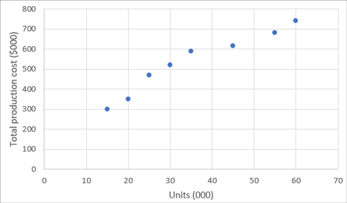
One method of understanding the relationship between the variables is the line of best fit method. All the data given is plotted on a chart. The activity level is the independent variable (as described above) and it is shown on the x (horizontal) axis. The total production cost is the dependent variable and it is shown on the y (vertical) axis.

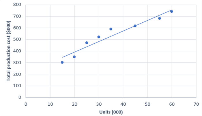
Once all the data is plotted on the graph, a line of best fit can be drawn:

In this case some of the points are on the line and some are above and below, but most are close to the line which suggests that there is a relationship between activity level and the total production cost.
This ‘line of best fit’ can be used to predict what will happen at other levels of production. For levels of production which don’t fall within the range of the previous levels, it is possible to extrapolate the ‘line of best fit’ to forecast other levels by reading the value from the chart.
This is a straightforward technique, but it has some limitations. The main one being that the ‘line of best fit’ is estimated from the data points plotted and different lines may be drawn from the same set of data points. A method which can overcome this weakness is regression analysis.
Regression analysis
Regression analysis also uses the historic data and finds a line of best fit, but does so statistically, making the resulting line more reliable.
We assume a linear (straight line) relationship between the variables and that the equation of a straight line is:
y = a + bx
where:
a is the fixed element (where the line crosses the y axis)
b is the variable element (gradient of the line) and
x and y relate to the x and y variables.
a and b are calculated using the following formulae:

These formulae are given on the PM formulae sheet.
The easiest way to tackle these calculations is to first set up a table with columns for x, y, xy and x2.
(note: the table also contains a column for y2. This will be required in a later calculation)
|
Units (000s) x |
Total cost ($000) y |
|
|
|
20X1 Q1 |
15 |
300 |
4,500 |
225 |
90,000 |
20X1 Q2 |
45 |
615 |
27,675 |
2,025 |
378,225 |
20X1 Q3 |
25 |
470 |
11,750 |
625 |
220,900 |
20X1 Q4 |
55 |
680 |
37,400 |
3,025 |
462,400 |
20X2 Q1 |
30 |
520 |
15,600 |
900 |
270,400 |
20X2 Q2 |
20 |
350 |
7,000 |
400 |
122,500 |
20X2 Q3 |
35 |
590 |
20,650 |
1,225 |
348,100 |
20X2 Q4 |
60 |
740 |
44,400 |
3,600 |
547,600 |
Totals (∑) |
285 |
4,265 |
168,975 |
|
|

The equation of the regression line (in the form y = a + bx) becomes:
y = 208.90 + 9.1x
Using this equation, it is easy to forecast total costs at different levels of production, for example for a production level of 80,000 units, the estimate of total cost will be:
208.90 + (9.1 x 80) = 936.90, or $936,900.
How reliable this estimate is will depend on the strength of the relationship between the two variables; how much of the change in y can be explained by the change in x?
The stronger the relationship between the variables, the more reliance can be placed on the equation calculated and the better the forecasts will be.
A measure of the strength of the relationship between the variables is correlation.
Correlation
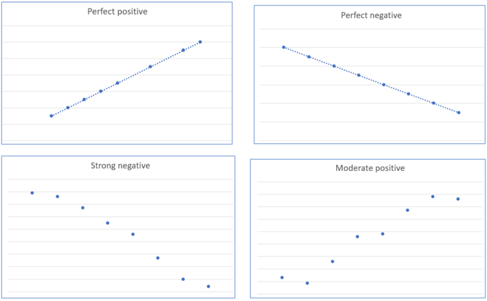
Two variables are said to be correlated if they are related to one another and if changes in one tend to accompany changes in the other. Correlation can be positive (where increases in one variable result in increases in the other) or negative (where increases in one variable result in decreases in the other).
The chart shown in the ‘line of best fit’ section above shows a strong positive correlation. Some other relationships are shown below:

It is possible that there is no correlation between the variables. A horizontal line would suggest no correlation, as would the following:

Where a company wants to use past data to forecast the future, the stronger the correlation, the better the estimates will be.
The strength of correlation between variables can be measured by the correlation coefficient which can be calculated using the following formula:

r = 1 denotes perfect positive linear correlation
r = -1 denotes perfect negative linear correlation
r = 0 denotes no linear correlation
The value of the correlation coefficient must lie between -1 and 1. The closer the value is to 1 and -1, the stronger the correlation.
Using the previous example to calculate r:

r = 0.965 which indicates a strong positive correlation.
A further calculation is the coefficient of determination which is calculated as r2.
The coefficient of determination gives the proportion of changes in y (the dependent variable) that can be explained by changes in x (the independent variable). In this example, r2 = 0.931, so 93.1% of the changes in total production cost can be explained by changes in activity levels. This means that 6.9% of the changes must be due to other factors.
Conclusion
Care must be taken however when using regression analysis and correlation to make future forecasts. The calculations performed can only suggest that a relationship exists between the factors, it cannot prove the relationship. It is possible that there are other factors involved in the changes in the variables which may not have been considered.
Also, like time series analysis, which is dealt with in a separate article, regression analysis uses past observations to attempt to predict what will happen in the future. The assumption that what has happened in the past is a good indicator of what will happen in the future is a simplistic assumption. In the real world, changes in the environment (technological, social, environmental, political, economic etc) can all create uncertainty, making forecasts made from past observations unrealistic.
Written by a member of the Performance Management examining team


