Accounting data is often presented in the form of tables of numbers, sometimes simply as a print out from a spreadsheet or reports from an accounting software package. While this style of presentation provides detailed figures, it may not always be the most effective way to present and communicate information. It may be that some key information should be highlighted, perhaps relationships between certain figures should be emphasised, or trends identified. Appropriate presentation of data in the form of graphs or charts can be a useful analysis tool and if the data is then effectively interpreted this can facilitate the decision-making process. The syllabus for MA2 and FMA/MA require that candidates should be able to describe the key features of different charts, identify suitable charts in particular situations and interpret data presented in charts. The material in this article is also relevant for candidates sitting MA1.
There are many software packages that allow the user to create charts that look very professional but it is important to consider the different types of charts available and select an appropriate chart type for the data being presented. Presenting data in an inappropriate chart can convey information which may be misleading. The term ‘chart’ is generally considered to include all types of graphs and any other type of chart used to give a pictorial presentation of the data. Some types of charts tend to be described as graphs while others use the term chart, eg it is more common to hear the term line graph but the term bar chart. The words ‘chart’ and ‘graph’ are considered to be interchangeable for the purposes of this article.
A variety of chart types will be reviewed in this article, and the features that make a particular chart type appropriate for the type of data being presented will be highlighted. Some useful tips on presentation will also be provided, together with guidance on interpreting the data presented in the charts. To illustrate the point of ensuring that an appropriate chart type is selected, some data has been presented using an inappropriate chart type resulting in ineffective communication of information.
Column, bar and line charts for a single data set (Charts 1-5)
In each of the Charts 1-5, a single series of data is represented on the graph. Often the data being presented in this type of chart spans a number of time periods such as years, quarters or months but these types of charts can also be used to represent data from one time period but, for example, from different regions or perhaps for different output levels. These charts are drawn with two axes, with the independent variable being shown on the x-axis and the dependent variable shown on the y-axis.
Charts 1 and 2 are examples of simple column charts. The columns represent the value of the data vertically and each column will be of a uniform width. Note that the heights of the columns vary to reflect the data values but the width of each column on a specific graph will be the same. Although the two charts are the same basic chart type, there are some minor differences in style that are worth pointing out. Chart 1 shows data for total sales over a five-year period with the years being shown on the x-axis and the $ amounts on the y-axis. A key or legend is displayed emphasising that the data relates to Total Sales and while a legend is often included automatically by the charting software it is not necessary when there is only one data series as long as the chart has an appropriate title. Chart 2 is also a simple column chart but the data relates to one year only and each column represents a division of the business so the x-axis is not years but the divisions, North, South, East and West. Notice also that the style of the chart has slightly changed as it is presented in a 3D format, the legend has been removed and the y-axis scale is in round thousands with the axis label having been changed appropriately.
Chart 1
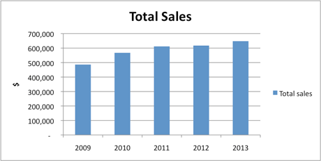
Chart 2
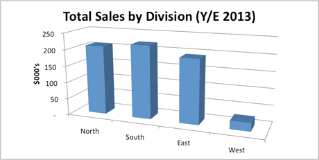
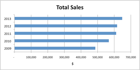
Chart 3 is an example of a simple bar chart. Bar charts are similar to column charts and are used to present similar types of information but the data is presented in the form of horizontal bars rather than vertical columns, so the years are still the independent variables and therefore are still represented on the x-axis but this is now shown on the vertical axis rather than the horizontal axis.
Chart 3
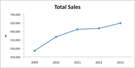
Charts 4 and 5 are simple line graphs. This is a very common style of graph particularly when showing variation over time. To the reader, these give an indication of moving from one period to the next as the points are connected and for Charts 4 and 5 this gives a good sense of change and can help the reader identify a trend. In fact both of these charts show identical data but due to changes in the y-axis scale, the reader might interpret the information differently.
Chart 4
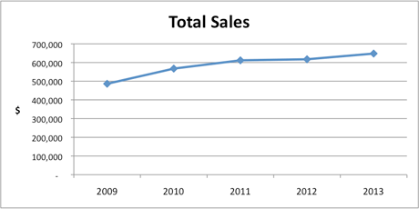
Chart 5
How will the reader interpret the data in Charts 1–5?
Charts 1 and 3 show identical data presented in similar chart formats (column and bar). Both of these chart types provide the reader with a clear indication of the fairly gradual increasing trend in total sales and with the help of the gridlines, the approximate sales values achieved each year can be read from the chart. This trend may be more visually obvious to the reader in the line graphs shown in Charts 4 and 5. In Chart 4, the vertical y-axis scale begins at zero so the first point plotted appears high on the scale. The reader of this graph may interpret the sales trend as one of fairly gradual and modest growth over the five-year period. Contrast this with the message that is communicated by Chart 5. This chart uses the same data but the message conveyed here is one of sharp increases in the period 2009–2011 and the increase between 2012 and 2013 appears more significant than it did in Chart 4. This is a result of changing the scale so that the vertical axis scale begins at a value just below the first data value. Chart 2 provides the reader with a clear picture of the breakdown of sales by division for one particular year and highlights that the West division makes a much smaller contribution to the total sales than the other three divisions. It is worth noting that some care should be taken when reading the values from a 3D chart of this type. It is the back wall of the column that provides the accurate value. In Chart 2 the sales for North division are actually over $200,000 but if we were to read off from the front wall of the column it would appear that sales are below the $200,000 gridline.
Column, bar and line charts for multiple data sets (Charts 6-8)
Column, bar and line charts can all be used to show multiple data sets provided that the numerical range of the data is similar. (Note that it is possible to plot two sets of data with significantly different data values on the same chart but this type of graph is out of the scope of the syllabus).
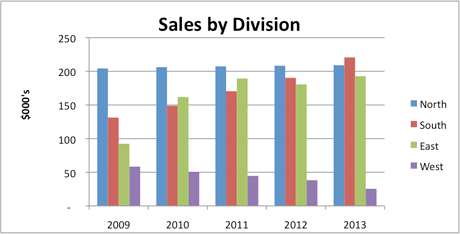
Charts 6 and 7 show the data for both total sales and total costs plotted on the same chart, with Chart 6 displaying the data as a column chart and Chart 7 as a line graph. Chart 8 shows the total sales for each of four divisions for each of the five years 2009–2013. Column/bar charts showing multiple data sets are sometimes called compound column/bar charts, though Excel uses the term 'clustered'. Note that in all three of these charts the legend or key becomes an important element of the graph so that the data sets can be distinguished.
Chart 6
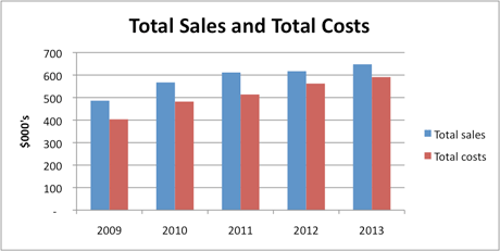
Chart 7
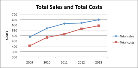
Chart 8
How will the reader interpret the data in Charts 6–8?
This type of graph can be used for comparison of the different data sets in absolute value terms and over multiple periods. In Charts 6 and 7, the reader can compare the relationship of total costs to total sales over the five-year period and will notice that in 2012 and 2013 the level of costs compared to sales has increased. In Chart 6 this is clear as the step down between the columns for total sales and total costs has reduced. In Chart 7 the visual representation of the two lines coming closer together makes it particularly clear to the reader that the total costs are rising at a faster rate than total sales. In Chart 8, the reader is faced with a lot of data on one chart with four data sets for each of five years resulting in a total of 20 columns on this chart. While the data presented is still clear, care should be taken not to overload one chart with too much data. The reader can interpret this information by either considering the composition of sales by division for any one year or by selecting each division in turn and considering the change in sales levels for each division over the five-year period. This chart does allow the reader to compare the components of sales each year in actual sales value terms (later we will look at other charts which provide this analysis in percentage terms). Note that this type of chart does not provide the reader with the figure for total sales (unless the reader adds up the totals of the four columns). Chart 8 shows that while the sales of North division have remained fairly constant over the period, there is an upward trend in sales for South and East (except for a small dip in East division sales in 2012) and a downward trend in sales for West division.
Component/stacked column and bar charts (Chart 9)
A component column (or bar) chart, also referred to as a stacked chart, highlights not only an overall total value for multiple time periods (or products, or locations etc), but also provides an analysis of the components of that total. The total figure is represented by the height of the column (or length of the bar), and the column or bar is divided into the various components of the total with each component being identified by different colours, patterns or shading. Pie charts, which will be discussed later, can also show an analysis of a total by its component parts but this can only be shown for one period (or product/location etc) at a time.
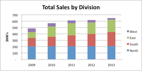
Chart 9 is an effective example of this type of stacked column chart. The top of the vertical columns reflect the total sales but the four components shown by the different colours show the changing composition by division of the total sales over the five-year period. The same information could also be presented in the form of a stacked bar chart with the data being represented by component horizontal bars rather than columns.
Chart 9
How will the reader interpret the data in Chart 9?
By reviewing the height of the columns, the reader can clearly identify that there is a trend of gradual growth in total sales over the period 2009–2013. On closer inspection of the components of each of the columns it appears that the level of sales for North Division has remained fairly constant (at just over $200,000) each year while South Division has experienced fairly significant increases in sales each year. East Division also appears to have had increased sales each year, with the exception of 2012. Finally, West Division, which accounts for the smallest level of sales in each of the five years, is actually facing a reduction in its sales over the period. This chart provides useful information for decision making as it highlights both overall figures but also provides useful analysis of the totals by division. The reader may choose to investigate the breakdown further to discover the exact percentage that each component contributes to the overall sales figures.
Pie charts (Charts 10 and 11)
A pie chart also shows the breakdown of the components of a total figure but each pie chart can only show the components of a total for one period (or one product/location etc). To show multiple periods requires multiple pie charts. In preparing a pie chart the charting software will automatically calculate the percentage of each component in relation to the total. The percentages are then shown on a circle or pie with the entire circle representing 100%. This can, of course, be done manually using a protractor to mark the required number of degrees for each segment. As the full circle is 360 degrees then a component that represents a quarter of the total would be drawn as a 90 degrees slice on the pie.
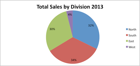
Charts 10 and 11 are examples of simple pie charts showing the breakdown of total sales by division for two years, 2009 and 2013. By comparing the sizes of the slices on the pie (the % values are usually shown on the pie, though these can be shown outside the pie itself or replaced with absolute values) these charts clearly communicate the change in the divisional sales relative to each other over this five year period. Note that there are slight variations in style between the two graphs as the data labels appear on the pie in Chart 10 but are shown as a legend in Chart 11.
Chart 10
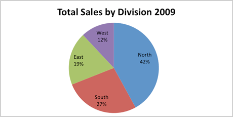
Chart 11
How will the reader interpret the data in Charts 10 and 11?
By reviewing the single pie chart for 2013 (Chart 11), the reader can clearly see that North, South and East divisions have all achieved fairly similar levels of sales with South accounting for 34%, North 32% and East 30% of the total sales for the year. It is also immediately obvious that West division at just 4% of the total sales is significantly underperforming compared to the other divisions. Looking at this year in isolation, however, does not give the entire story. Could it be that West is a newly opened division and has yet to make an impact in the market? By looking at the same data for 2009 (Chart 10) and comparing the percentages it is clear that is not the case. In 2009 West contributed 12% of the total sales. That doesn’t necessarily mean that absolute sales of West have fallen (although in fact we know that is the case from the data as it is presented in Charts 8 and 9) but certainly it does mean that as a percentage of the total they have become much less significant. South and East divisions have both increased their share of the total while, like West, North division has also reduced its share of the total from 42% in 2009 to 32% in 2013, although in absolute sales value terms, North’s sales have remained consistent as shown in Charts 8 and 9.
It is important to remember that a pie chart does not show the total values but only a breakdown of those values. It is quite possible that certain components of the pie chart could increase in percentage terms when compared to a similar pie chart for an earlier period but if the overall total had fallen then the absolute number could still be lower.
100% stacked column or bar charts (Charts 12 and 13)
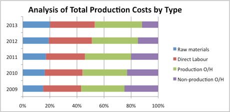
Charts 12 and 13 show 100% stacked (or component) column and bar charts respectively and these provide similar information to that shown in a pie chart as the components of a total can be viewed but the actual total amounts are shown as 100%. This provides similar information to what could be achieved by producing five separate pie charts. Although percentages may not be automatically shown for each component for this type of chart, there is usually an option to allow these percentages to be displayed on the columns or bars.
Chart 12
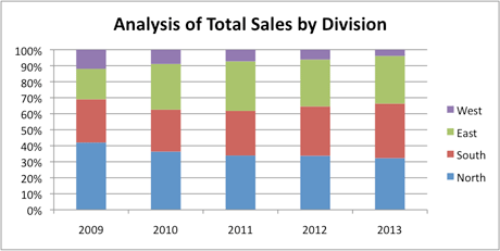
Chart 13
How will the reader interpret the data in Charts 12 and 13?
Charts 12 and 13 do not provide the reader with any information regarding the level of total sales or total production costs and so it is not possible to comment on any trend as to whether total sales and total costs are rising or falling over this five-year period. They do however provide useful analysis of the breakdown of sales by division (Chart 12) and the breakdown of total production costs by type (Chart 13) over this period and this can be useful information for decision making. We can clearly see from Chart 12 that there has been a gradual change in the composition of sales by division over the period. Again it is important to remember that a falling (or increasing) percentage does not necessarily mean that absolute figures are falling (or increasing). Chart 13 also shows that raw materials, direct labour and production overheads have gradually been accounting for a larger portion of the total costs while non-production costs have significantly reduced as a percentage of the total.
Scatter diagram or XY chart (Charts 14 and 15)
Scatter diagrams can be used to plot two sets of numbers as one series on the chart with one number becoming the x coordinate and the second number becoming the y coordinate. The scatter diagram has two numerical axes representing two variables.
The data provided in the table below has been used to create a scatter diagram showing the relationship between output levels and total costs. Output levels vary each month but some months have the same output level but different costs.

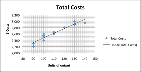
This information has been presented in Chart 14 as a scatter diagram. Notice that the points may be clustered around a particular output level. The scatter diagram points can be used to estimate a trend and a trend line, or line of best fit, can be added to the chart to provide useful information for forecasting as shown in Chart 15.
Chart 14
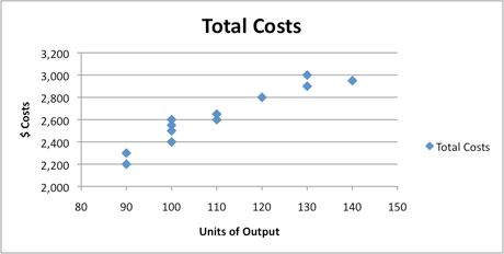
Chart 15
When data presentation goes wrong
Having considered a variety of charts that present information that aids decision making, it is worth considering some situations where choosing the wrong type of graph, or perhaps an inappropriate scale can produce results that do not provide useful analysis of the data or perhaps even provide incorrect information. To avoid confusion with other appropriate graph types within the article which have been labelled numerically, these inappropriate chart types have been labelled as Charts A through D.
Chart A uses the same data as Chart 2 but the line graph is less effective for this type of information as each division’s performance is not necessarily connected to the previous division’s performance but by connecting the points on the line this graph seems to suggest this type of flow. Notice also that the chart title does not tell the reader what data is being presented (sales/costs/profits?) and the y-axis has no title, so, again, the reader does not know what these figures represent. This is, therefore, an example of a graph which does not communicate information effectively. Chart 2 provides a clearer presentation than Chart A for that particular data set.
Chart A
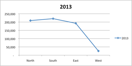
Chart B is an example of a multiple line chart but here the scaling is a problem. The raw material costs per kg of A fluctuate around $4–5, B costs fluctuate between $6–7 and C between $8–9. In order to show the data for all three materials on the same graph the scale must extend from around $3 up to $9. As a result any small variations in price are not being clearly communicated on this graph. This is therefore an inappropriate graph type for this data. Chart 16 shows a single line chart using the same data but for raw material A only and the reader can now clearly see the fluctuations in the raw material unit cost and consider the impact of this on product costing.
Chart B
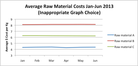
Chart 16
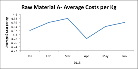
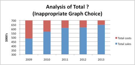
Chart C is an interesting example. Here, a stacked column chart has been prepared combining the 2 data sets of total sales AND total costs which were shown in Charts 6 and 7. This is in fact an inappropriate chart type for this data. We should ask ourselves, what is the figure called that is the result of adding together total sales plus total costs? This is a meaningless figure and this data should NOT be presented in the form of a stacked column or bar chart. Chart D shows a 100% stacked column chart but like Chart C it is attempting to show a breakdown of a meaningless total figure and so is an inappropriate use of the 100% stacked column chart type. Care must always be taken to select an appropriate chart for the data being presented.
Chart C
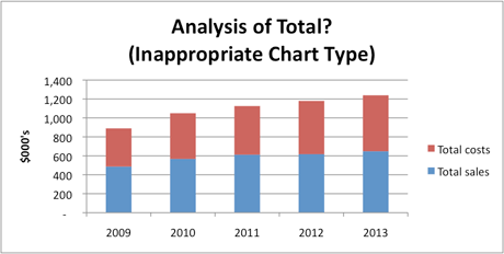
Chart D
Conclusion
With so many different types of charts and graphs available (and those shown here are just some of the most commonly used charts), care must always be taken to ensure that an appropriate chart type is chosen to effectively present and communicate the information to the user. We also saw the effects of an inappropriate scale being used in Chart B so even when an appropriate chart type is selected, issues such as scaling, suitable titles and legend types must be carefully considered to ensure effective communication of the data so that it can be interpreted to aid decision making.
Written by a member of the management accounting examining team


